In this edition of Deadsites, we’re taking a look at the official movie site for 2002’s Ghost Ship.
Starring Gabriel Byrne and Julianna Margulies, it’s about an abandoned luxury liner stuffed with treasure and torment. Here’s the trailer:
I saw Ghost Ship exactly once, on a night when I was too wired to fall asleep, but not lucid enough to fully absorb the weird shit on television. Regardless, I remember liking the film. After a freakin’ killer opening (where we see the ship’s original passengers die in comically gory fashion), Ghost Ship settles into something best summarized as The Shining mixed with Event Horizon… on a boat.
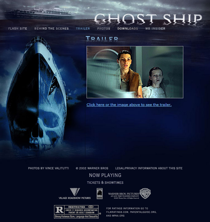
I’m a sucker for any movie involving disasters at sea, but that’s not why I’m writing this. Actually, what tickles me is how Ghost Ship’s website is such a classic example of the many “official horror movie sites” of its day. If you were paying attention to such things in the early 2000s, you should recognize its structure from a hundred other sites. It was like they all made skins from the same template.
The intro page included a link to the trailer, and please pay attention to Julianna’s face in that screenshot. I’ll tell you why later.
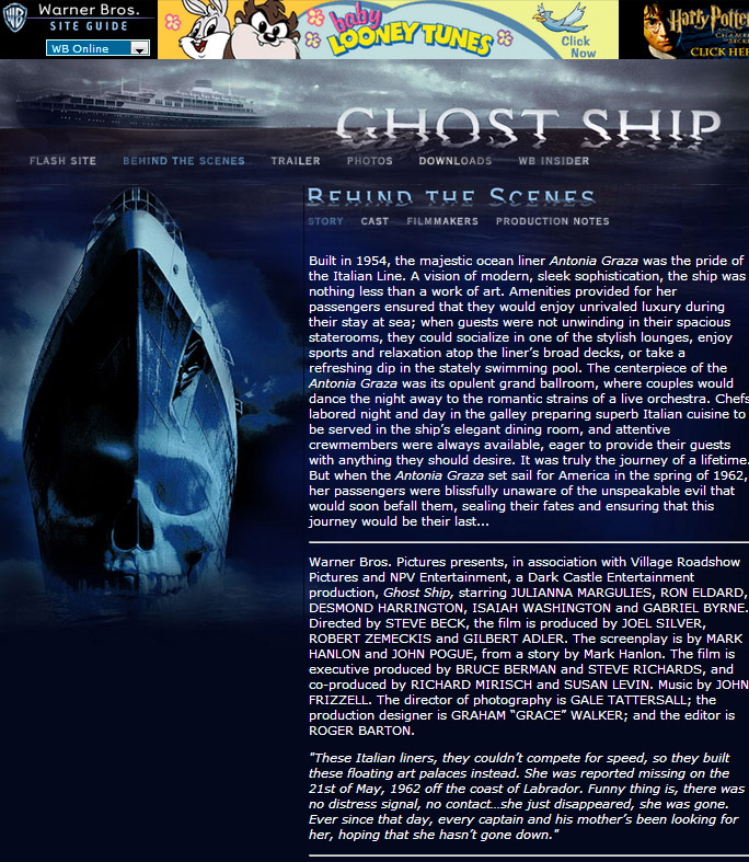
Another primary page tells the story of the movie, and provides background on its production. Without bothering to check, I’m certain that it’s copy/pasted from Ghost Ship’s press kit. Honestly, the most interesting thing on this page is the banner ad for Baby Looney Tunes, another Warner property that debuted that same year.
(Isn’t it weird to see Baby Bugs hovering over the image of a skull-faced ocean liner? Kinda takes you out of the moment.)
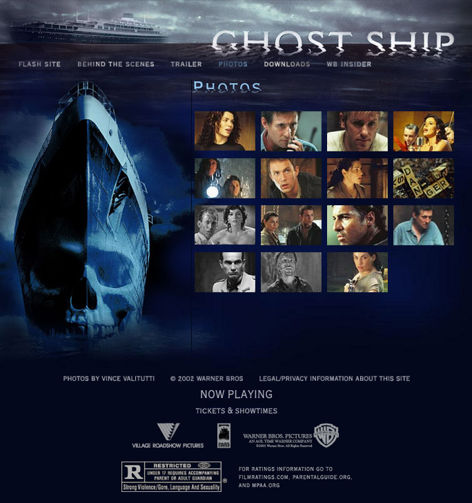
Next was a simplistic photo gallery, which existed more to show off the cast than to dive into the movie’s spooky doings. In other words, they don’t show much in the way of gore.
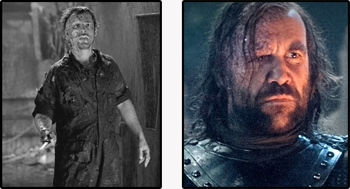
While looking over the images, I realized that one of the fucked up ghost dudes bore a striking resemblance to Sandor Clegane:
Maybe it’s just me?
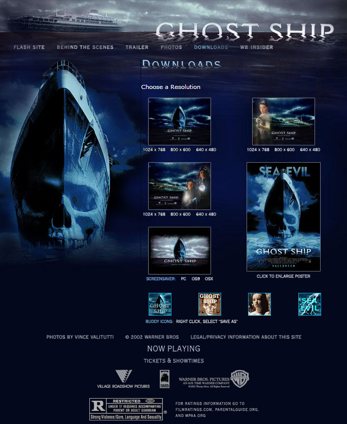
We then move onto a rudimentary “downloads” section, with enough goodies to seem full, even if there was nothing beyond what you’d have gotten on a bazillion similar sites. (I’m not complaining. The site’s relative plainness is exactly why I’m featuring it. Ghost Ship was no typical movie, but its website sure was.)
Disregarding the desktop backgrounds for a moment, let’s focus on the buddy icons at the bottom. God, those things! During this era, every movie site had them.
It gives me pause to think that I might have readers too young to know what those icons were for, but if I do, you could use them with AIM and other instant message programs as your chosen avatar. Not many of you use instant messaging in its older form, but if there’s a straggler in the audience, here’s the full set:


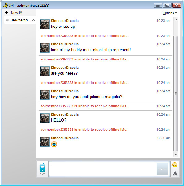
I doubt these were popular downloads, because in a sea of icons filled with dancing babies and cats with twirling eyes, Ghost Ship could never compete. For all I know, I’m the first person in history to use one:
This is the proudest I’ve felt in MONTHS.
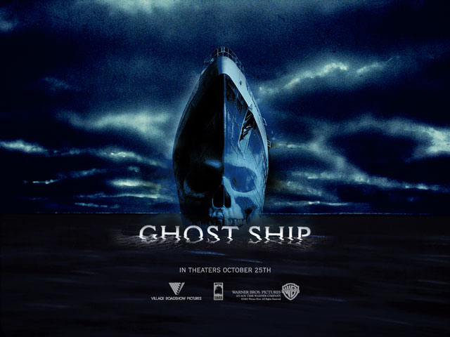
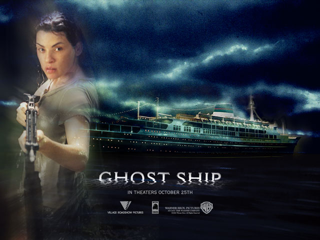
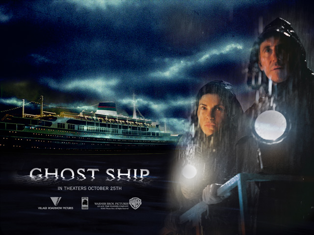
Oh, and those desktop backgrounds. Here are a few of them:
I’ve noticed sinister forces at play with Ghost Ship’s old website. Apparently, the person behind it was no huge fan of Julianna Margulies. Seriously, could he have picked worse shots of her? I get that this was a supernatural disaster movie filled with reasons for its characters to look unkempt, but Julianna Margulies is gorgeous, and I’m a longtime member of her fan club. I feel it’s my duty to find these shot choices offensive.
I’d always been under the impression that the film flopped, but from what I’m reading, it was a financial success. I think that had as much to do with its logo as anything else. Even after a dozen years, the image of a skull-faced ship hasn’t lost one ounce of greatness. It looks like the corpse of Beldar Conehead.
(Though I suppose releasing a movie like this just a few days before Halloween didn’t hurt, either!)
