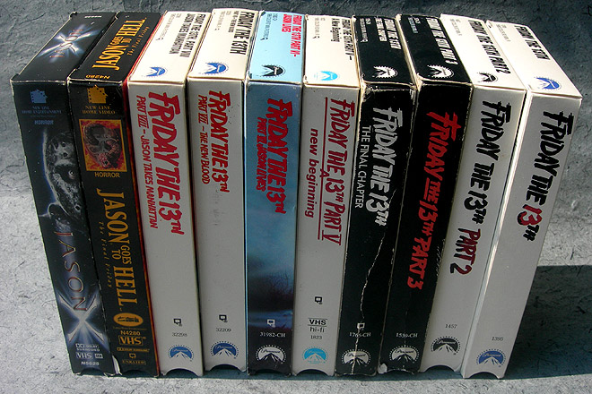
Friday the 13th: Ranking the VHS Box Art!
The last time I wrote about Friday the 13th, a reader asked how anyone could be into those movies. As much as I love the franchise, I had to admit…the question had merit.
Unfortunately, the reasons we love the films aren’t easy to summarize, because we all have totally different ones. I have a friend who’s a few years older than me. He was a born a horror fan, and grew up on the movies. Saw all of them in the theaters during their original runs. For him, the films rekindle lots of great memories. They’re a window to his adolescence, if you believe that movies featuring mass murder and wanton sex can be that.
For me, it’s something else. I wasn’t into horror movies as a child. Jason scared me to death, even if I dressed as him for numerous Halloweens. The first Friday the 13th I watched by choice was Jason Takes Manhattan, and hell, that was the eighth installment! I was way into adulthood, or at least my version of it, before becoming an addict.
I think it’s just the vibe I get while watching them. It’s kind of like a thunderstorm without the rain. It’s hard to argue that a Friday the 13th movie can bring peace, but when I throw one of them on, and it’s late, dark and otherwise quiet, time seems to slow and nothing seems intense. It’s weird, I know.
And then, if you asked some other guy, he just likes them because of the cool kills and nudity woodity.
So yeah, it’s hard to explain. And it’s even harder to name the best movie in the series, because few fans will ever agree on the true pecking order. It’s totally subjective. What anyone says will be tainted by their own experiences and inclinations. In other words, Part 2 is the best one, trailed closely by Parts 3 and 4.
I don’t know how the preceding paragraphs connect to the point of this article, but here we are.
I watch F13 movies on DVD, but I still have ‘em on VHS. In fact, I bought the VHS copies long after purchasing the DVDs, for reasons I didn’t comprehend until the idea for this article hatched in my brain several hours ago.
I wasn’t a Friday the 13th fan as a kid, but I was still way familiar with the videocassettes. It was hard not to notice them in video stores, sitting all in a row within the horror section. I may have balked at actually watching scary movies, but I don’t think I’ve ever gone to a video store and not browsed the horror section. That was the safe kind of dangerous. Whenever shit was about to hit the fan, the comforting visage of Mickey Mouse was three steps away.
Video stores were a big deal back then, obviously, and the box designs were of crucial importance. I’d argue that the cover art was much more important on those old tapes than it is with DVDs and Blu-rays today. We were a mostly rental society, and we didn’t have the Internet to tell us what to bother with. In many cases, all we knew of our movie choices was what the boxes showed us. They needed to be as fetching as possible.
It was no different with the Friday the 13th series, and upon reviewing these ancient tapes, I’m struck by how certain entries had far cooler box designs. I’m even more struck by how some of the best designs were given to the worst F13 movies. Since we’re now entering the point where I cut the preamble and serve the meat, I find nothing obnoxious about marking the next paragraph in bold.
I am going to rank the videocassette box designs for every Friday the 13th movie. We’ll go from the worst to the best. The criteria for these rankings is on box art alone. My personal feelings about each film will be completely discounted. I shall pretend I know nothing about Friday the 13th, aside from it being about a guy in a hockey mask who kills people.
Oh, and before we begin: I’m not including Freddy Vs. Jason, because by rights, that’s Freddy’s movie. I’m also excluding the F13 remake, because I hate it, and I doubt it was released on VHS anyway. We’re sticking with the original series only. Friday the 13th Parts I – X.
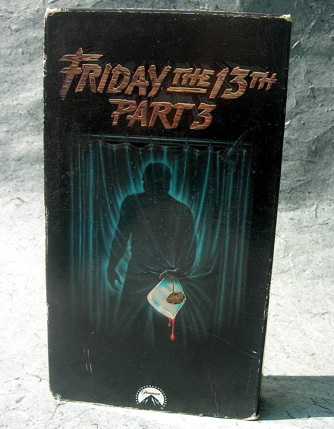
#10: Friday the 13th Part 3
This box design comes in dead last, and it’s the only one I actively despise. It’s just so boring and plain. Even Jason’s silhouette looks apathetic. Plus there’s this weird crud stuck to the front of the box. It could be cat shit.
If I knew nothing about F13, this box would not persuade me to change that. I can’t believe they managed to take something as no-fail as a classic shower stabbing and make it seem so blah, but here it is.
Everything about it sucks, but in the designer’s defense, he (or she) had one major obstacle. Jason really didn’t find his identity until Part 3, and it isn’t until late in the film that he first dons the hockey mask. To show the mask on the box would’ve been a spoiler, I guess, so instead we got Random Shadow Guy. I hate Random Shadow Guy.
Just a total shame, since Part 3 is one of the best films in the series. I understand that it was originally in 3D, and they couldn’t carry any of those gimmicks over to the box art, but even without that, Part 3 gave the designer plenty of material to work with. Even a zombified hand rising from Crystal Lake would’ve worked. Anything but this.
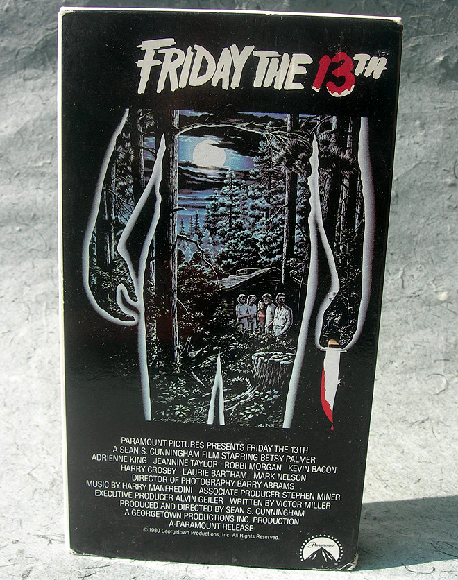
#9: Friday the 13th
The original Friday the 13th didn’t have great box art, but despite its low ranking, it isn’t as if I loathe it. The remaining movies just had better boxes.
If nothing else, out of all the boxes, this one does the best job of capturing the unsung star of the franchise: The “spooky woods.” I don’t think it’s a coincidence that my favorite films from the series are the ones set completely in the woods, and here, not only have they captured that, but they did it in the shape of a knife-wielding serial killer.
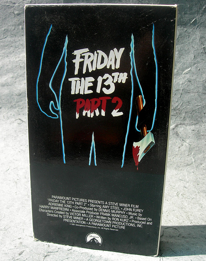
#8: Friday the 13th Part 2
Part 2 is my favorite of all Friday the 13th films, but again, I’m not letting my feelings about the movies influence these rankings. It hurts to put Part 2 in 8th place, but this design just…isn’t so hot.
Actually, you might be wondering why I put this one ahead of Part 1’s box, which was in the same style, but had much more going on. Honestly, I think it’s the “Part 2.” If I was in a video store and knew nothing about these movies, I’d just assume that “Part 2” was “Part 1 on steroids.”
Granted, going by that criteria kind of defeats the purpose of this review. Maybe that’s my bias seeping in. I can only go as low as 8th place for a movie like Friday the 13th Part 2.
Hey, at least they upped the ante on the weapons front. Part 1’s “box killer” held a knife. Now we have an axe. Axe beats knife. I am vindicated.
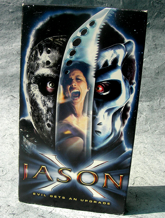
#7: Jason X
Even if it doesn’t go by that name, we can consider this Friday the 13th Part X.
Hmmm.
Part X. Jason X. Yeah, they knew what they were doing. Crafty sneaks.
The box design is much cooler if you know nothing about the movie. On a quick glance, you might even assume that the film starred two different Jasons! (In reality, Jason X was set in the distant future, where our battled-scarred hero morphs into an uber version, by way of a weird contraption on a spaceship.)
I saw this one in theaters, by myself. Back when I was with UGO, they sent me to a special screening, which was otherwise filled with a raucous crowd who’d won their tickets through radio contests and the like. Jason X was as much a comedy as a horror movie, and that was the perfect atmosphere to experience the film within. People yelling stupid things, laughing at all the wrong times, chanting “KILL HER KILL HER” whenever someone annoying walked onscreen. It was beautiful. I might’ve hated the movie if I didn’t have that kind of audience to show me how the film worked.
Anyway, the box. It’s pretty good. It piques my interest. I’m especially loving uber Jason’s big red eye. If I’m cluelessly browsing the last remaining Blockbuster, that big red eye might win Jason X a rental.
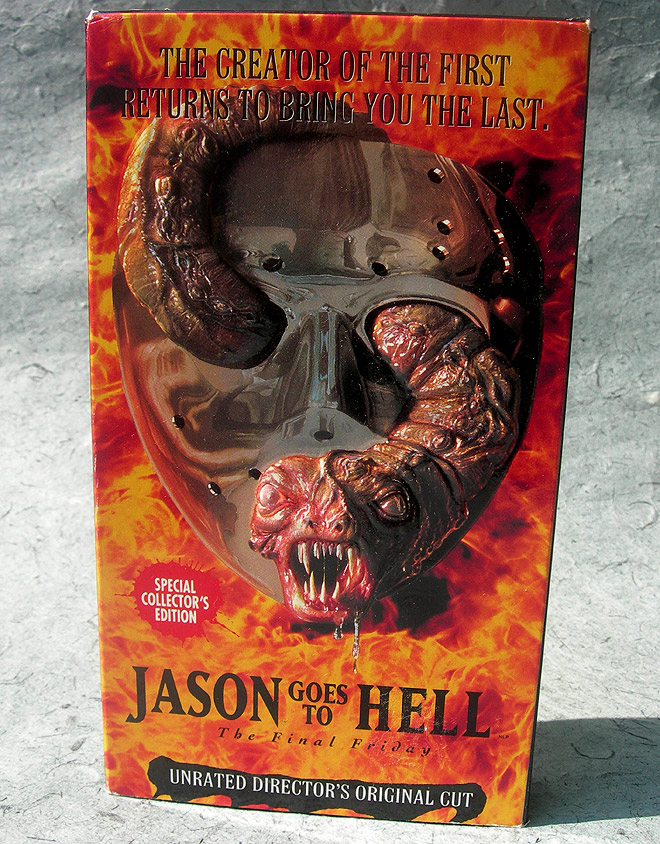
#6: Jason Goes to Hell: The Final Friday
Also known as Friday the 13th Part IX. At least by me.
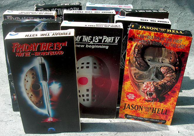
I’m not a fan of the film, but the box is pretty rockin’. Jason Goes to Hell came out in ’93, and the design certainly reflects “’90s horror.” Lots of flames, and more than a hint of demon activity. Very Mortal Kombat-like, which was appropriate for its time.
It’s hard to tell by the photo, but the box has an embossed cover, with the snake-demon-thing popping ever so slightly above the remaining features. This box was neck and neck with Jason X…until I noticed that 3D snake. It’s always the little things.
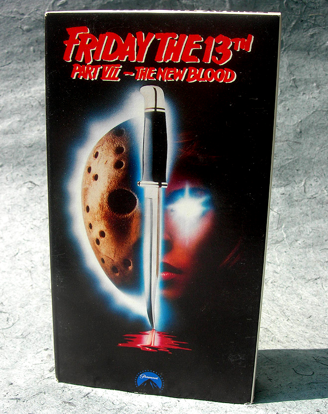
#5: Friday the 13th Part VII: The New Blood
Okay, starting with this one, we’re up to the box designs that I really, really like. Mileages vary and we all have our tastes, but from this point forth, there isn’t a box design that I wouldn’t love as a cheap poster in an expensive frame. (Not an unrealistic goal, since most of these designs doubled as the movie posters.)
Part VII’s design has such a great, eerie feel. If you knew nothing of the film, I guess you’d imagine that Jason Voorhees was about to match wits with some kind of angel with flashlight eyes. Actually, it was just Lar Park Lincoln, but you wouldn’t have been too far off.
I especially like this representation of the hockey mask. It looks more like a chocolate chip cookie in the shape of Jason. Toss in a little splattered blood for effect, and this is an overall wonderful design.
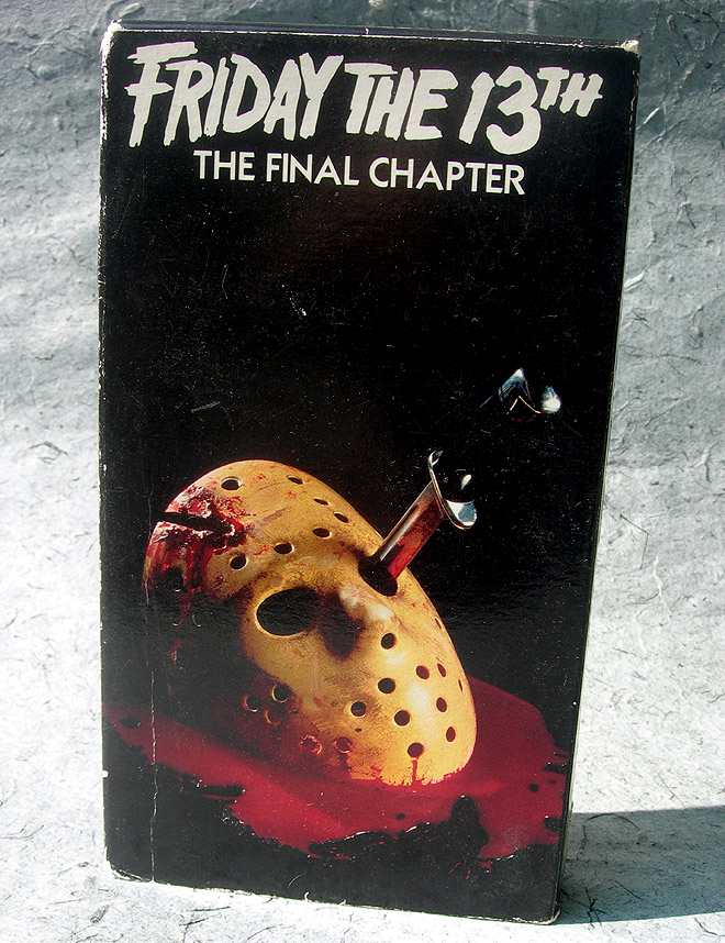
#4: Friday the 13th Part IV: The Final Chapter
Well, it was bound to happen eventually. Behold, the one and only time when my ranking matches up with the installment number. Part IV comes in fourth! It makes no sense, but this makes me feel so psychic.
In every other design that features it, Jason’s mask looks more like a graphical representation than an actual photo. Here, it’s definitely a photo, from pillar to post. Right down to the blood, everything you see was actually set up and photographed. This makes a huge difference, and pulls what might’ve otherwise been a lame design up to the almost-bronze position.
(Man, they even got the breakage points in the mask right. So good!)
Part IV was partly marketed as the “death of Jason,” so showing his bloodied mask with a knife through the eyehole was totally apropos. Though this “final” Friday the 13th was actually far from it, the film still marked the end of Jason Voorhees: Version 1. The next time we saw him, he was firmly supernatural and definitely more monster than man. To each his own, but for me, that wasn’t a change for the better.
Still can’t get over that real/fake blood on the box, though. It looks like spilt Kool-Aid. <3
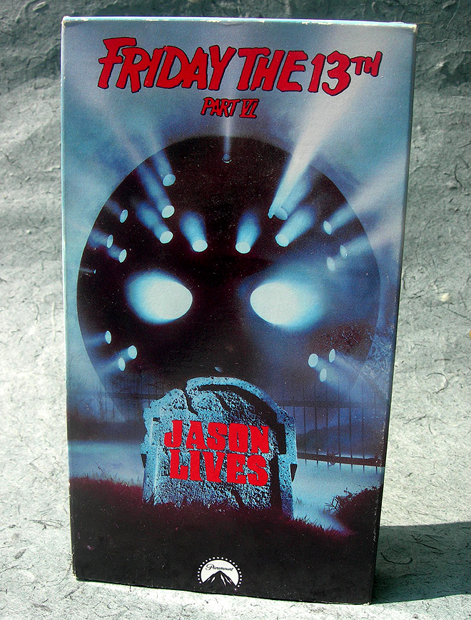
#3: Friday the 13th Part VI: Jason Lives
After the much-maligned Part V (where the killer ended up being someone other than Jason Voorhees), the producers knew that they had to bring the big man back. According to many, Jason Lives is the best Friday the 13th ever. I couldn’t disagree more, but this is a GREAT box. It screams “Halloween” more than any of the others, and even if that shouldn’t be a part of my criteria, fuck you it is.
I’m giving this one the bronze medal, and you can’t tell me that it doesn’t deserve it. Hell, maybe it deserves even better. From the backlit spooky mask to the needlessly foam tombstone, it’s just about perfect.
Of all the designs, this is the most attention-grabbing, too. You can’t look at that box and not wonder what happens in the movie.
If you’re reading this and you know nothing about Friday the 13th, do me a favor. Look over the photos, and tell me which box makes you the most curious. Possibly discounting Jason Takes Manhattan, I’m betting it’s this one.
And hey, speak of the devil…
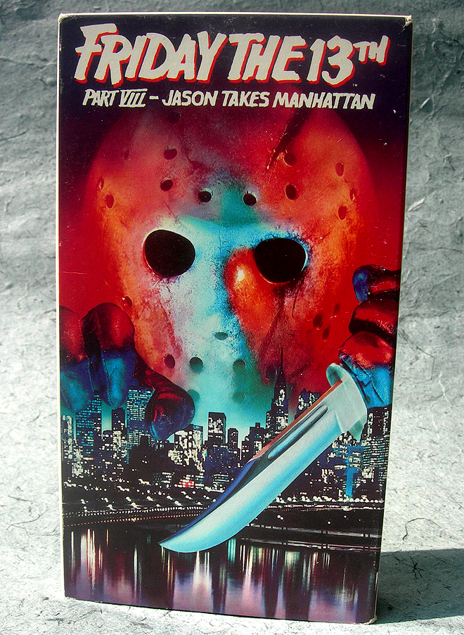
#2: Friday the 13th Part VIII: Jason Takes Manhattan
I’m trying to stay objective, but a big part of me feels that this deserved to be #1. I’m sticking with my position, but I wish it could’ve been a tie.
I’m one of the few fans of Jason Takes Manhattan. I hated it for the longest time, but by sheer force of will, I just kept watching the film until a sense of appreciation seeped in. It was the super idiot version of Stockholm syndrome.
Yes, it was a big cheat, where “Manhattan” didn’t come into play until more than half of the movie was over. (And even then, maybe two minutes’ worth was really filmed in New York.) Most of the film occurs on a boat (far lamer than it sounds), and even down to what Jason looked like unmasked, there was a whole lot to be disappointed about.
Still, there’s no denying that this is a tremendous design. I’m living proof. As mentioned, Jason Takes Manhattan was the first Friday the 13th movie I ever outright chose to see. This box was the reason why.
From Jason’s color enhanced mask (which somehow reminds me of a melting snow cone) to the ominously threatened New York City skyline, this is as good as it gets. Or at least, it would be, if I didn’t fall so hard for Part V’s box.
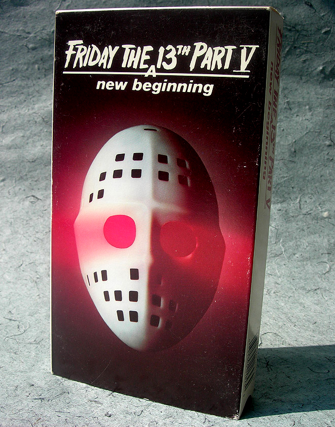
#1: Friday the 13th Part V: A New Beginning
Yeah, I can’t believe it either. The one Friday the 13th movie that everyone hates, and I’m naming it #1.
Hey, going by box design alone, this IS #1.
It’s simple, sure, but that works for it. The red lighting, the too-plain mask, the not-so-subtle outer glow – these things conspire to make the most quietly vicious of all Friday the 13th videocassette boxes. I’m not the type to wear my allegiances on a t-shirt, but I’d make an exception for a black one with that mask on the front.
Really dig the random “hole placement” on the hockey mask, too. I know nothing about goalies, but I assume the point of those holes is to let them breathe. Here, not so much. The mask looks like an avant-garde apartment building. I imagine the two red windows to be some form of mid-level entertainment complex.
I have no idea if you’ll agree with my rankings, and I’m curious to know how you’d rank them. Please do so, in the comments. And no, this isn’t some disguised method of getting this article more comments. It normally would be, but this time, I really am curious.
As for these old videocassettes, they will continue living out their lives as room décor. Only now that I’ve done this article, they’re going to do it with a whole lot of internal strife.
Never rate your babies, it can’t lead to anything good.

