Tonight, we pay tribute to horror DVD menu screens.
Somebody has to. They’re great. I own well over a hundred scary movie DVDs, and since I have the tendency to buy copies of films I’ve already seen ten thousand times, the real thrill, and frequently, the only thrill, is seeing how the production team summed everything up on those often cheesy, always awesome menus.
I plucked ten horror DVDs from my collection at random. Below are my thoughts on their menu screens.
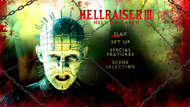
Hellraiser III: Dig it. With the chunky text and crude blood, it looks like a game from the original Mortal Kombat era. I thought Pinhead had black eyes, but even if this was editorialized, those red eyes work. Really brings the whole color scheme together.
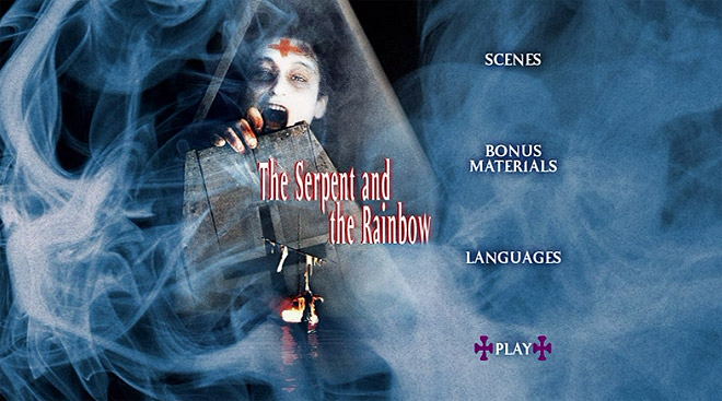
The Serpent and the Rainbow: Very underrated film that doesn’t get much love these days, so if you take anything from this review, I hope it’s the notion to watch The Serpent and the Rainbow.
Here we have Bill Pullman, dressed like an undead geisha, clawing his way out of a premature burial.
Nearly every promotional material associated with the film used this image, so even if you’ve never seen the movie, chances are, you’ve seen Bill Pullman freaking out with a cross on his forehead before. I don’t blame the menu makers for sticking with it, since it’s such a powerful visual.
I also like the randomly added Macanudo smoke.
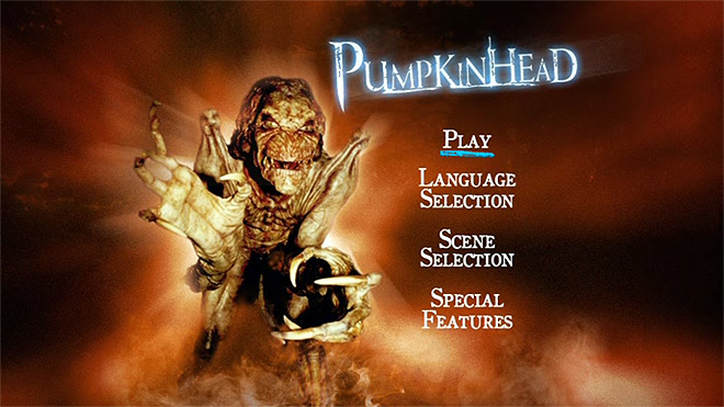
Pumpkinhead: Not my favorite menu screen. Pumpkinhead’s look was no huge secret, but I still think they could’ve been a bit more “hinty” about it.
All in all, this just looks too “fun.” I kept waiting for a late animation wherein Pumpkinhead would grab a top hat from some off-screen area, only to act out the “HELLO MY BABY” Spaceballs thing. That’s not what I want from Pumpkinhead.
Actually, that’s exactly what I want from Pumpkinhead. But if they weren’t ready to give it to me, this menu should’ve been creepier.
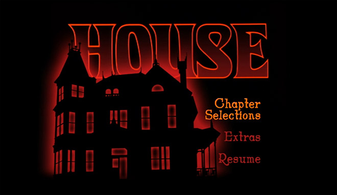
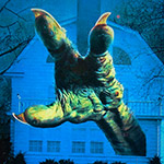
House: Utterly perfect, even if most of you won’t think so. House is a wonderful, bizarre movie that paved way for wonderful, bizarre sequels. Even with so much absurdity to draw from, I love how the menu keeps it simple and mysterious.
Forget William Katt, forget George Wendt – the real star of House was the house itself, stuffed with monsters and mayhem and at least one reanimated marlin corpse. You can’t look at this menu and not wonder what that house’s deal is. Toss in a red outer glow, and it’s an A+ situation.
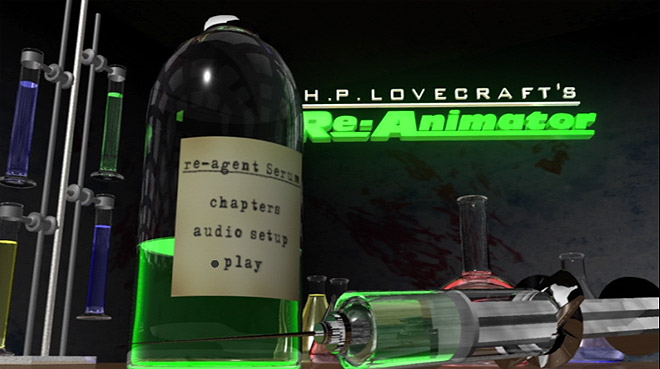
Re-Animator: I’m a sucker for that glowing green “re-agent” goop so prevalent in Re-Animator’s marketing materials, and I’m glad to see it on display here.
Since the DVD came out long after Re-Animator had already built its cult following, the menu makers were free to get goofy. If you knew nothing about the film and only had this to go by, boy, would you be in for a shock. There are so few movies featuring forced cunnilingus perpetuated by severed heads, and you’d never guess that this benign menu screen belonged to one of them. Good stuff!
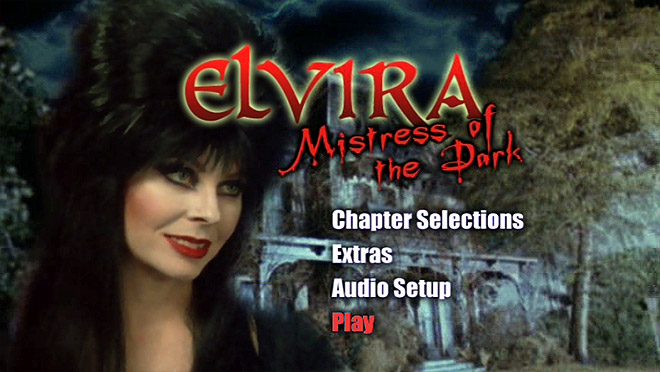
Mistress of the Dark: Elvira’s best movie, by far. Probably the best thing Elvira’s ever done, actually. The menu really captures her and the movie’s spirit, where creepy is more of a style than a theme. You obviously can’t tell by the static image, but every ten seconds or so, Elvira blinks innocently as lightning sparks the clouds.
I’m totally watching Mistress of the Dark as soon as I finish writing this. Maybe I’ll mention that to Edie McClurg. I’ve been dying to open communications with Edie ever since I started following her on Twitter.
UPDATE: I went for it.
No response yet. 🙁
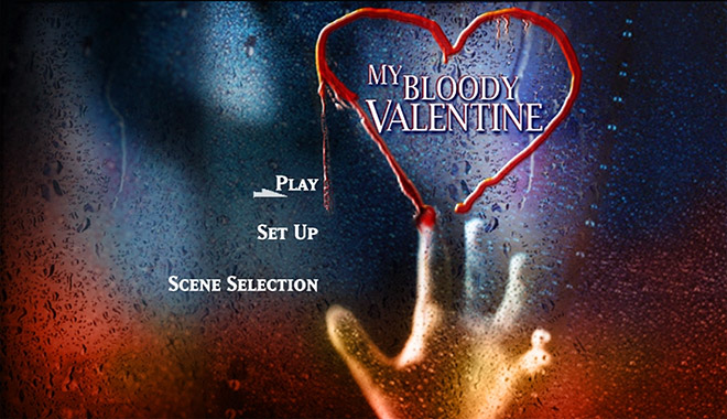
My Bloody Valentine: Sorry, but this one sucks. I love this film to death, but I can’t let that distract me from objectivity. With so many iconic shots and scenes to choose from, this was the best they could come up with?
My Bloody Valentine’s legacy stems from it being just like every other slasher film while being nothing like any other slasher film, and to get a menu screen this generic and charmless makes me want to hurl monkey meat on the people responsible for it. And yes I am willing to eat a monkey to do this.
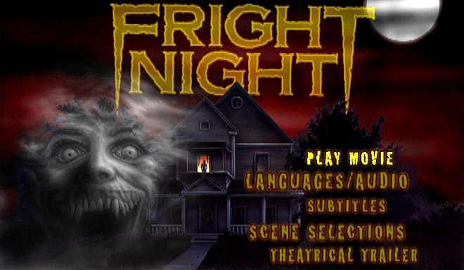
Fright Night: If Pinhead’s menu reminded me of video games from the early ‘90s, this one reminds me more of the Commodore 64 era. Love it! Even if it just rehashes the usual images associated with Fright Night, it’s done with such a low-rent, cheesy glee that I’d be completely okay with leaving this menu on my TV long enough to forever burn it into the screen. As soon as I’m done watching Elvira, I’ll get on that.
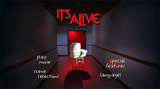
It’s Alive: I’ve never seen this movie. I’m ashamed to admit that, since It’s Alive and its sequels are considered classics. I have no recollection of buying this, and the fact that I own it could only mean that on some long ago evening, there I stood, in Best Buy, completely and totally hammered.
Still, the fact that I haven’t seen It’s Alive makes me the perfect audience for this menu screen. It doesn’t take a genius to know that there’s something weird in that stroller. A monster baby, or maybe a miniscule alien killer disguised in an infant’s Onesie. The menu hints at just enough to make my curiosity rage over It’s Alive. When I’m done with Elvira and after I finish burning the Fright Night menu into my TV screen, I’ll watch it.
God, I have a lot to do tonight.
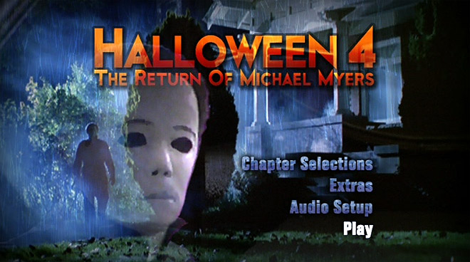
Halloween 4: I specifically chose to end with this one. Just think it’s the strongest of the menus featured here. Halloween 4 may very well be my favorite of the entire series, but I don’t think those loyalties are affecting my opinion. This is, simply put, just a great freakin’ menu.
Moving image overlays. A terrified suburban home. Storms and shadows. Orange fonts. Michael Myers. This menu shoots eight-pointers from every angle, and the sight of it has effectively transformed 9/18 into 10/31.
To read an article that’s almost exactly like this, I also ranked the Friday the 13th movies based on VHS box art alone.
As for this one: I’d originally planned to make it a much longer article, and review something like 40 different horror DVD menus. Then I realized that nobody wants to read through 40 descriptions of DVD menus. But, if you’re the exactly the kind of oddball who can’t get enough of them, I’ve posted images from several more DVDs on the second page.
No additional commentary on those, though. Dick Van Patten was almost right: Ten is enough.
lol
