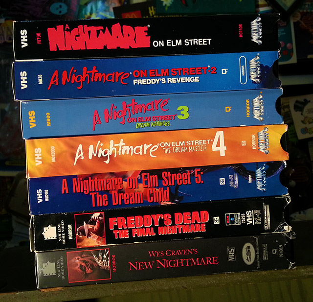
A long while back, I ranked all of the Friday the 13th films based strictly on the merits of their VHS boxes. It was only natural that I’d do the same for Freddy Krueger!
That’s my weird goal for today, and it isn’t as pointless as it seems! As I’ve mentioned before, videocassette boxes used to be of utmost importance. When we were cluelessly wandering video stores looking for anything that looked interesting, “great box art” often trumped movie reviews, word-of-mouth advertising and even TV commercials. This was especially true in the horror genre, where we weren’t even aware of many movies’ existences until we saw them sitting on the shelves of Ma and Pa’s Viddy Yo Emporium.
Before I start, some ground rules:
1. I’m not including Freddy vs. Jason or the remake. (Freddy vs. Jason is too much a “shared entity” to fit in, and I don’t think the remake even had a VHS release.)
2. Remember, these rankings are based on box art alone. I’m trying to toss aside everything I know about the movies to do this. If NOES was new territory, which boxes would grab me most?
3. With the Friday the 13th series, the quality ranged from “blah” to “awesome.” By contrast, even the “worst” NOES box is still pretty good. A low-ranked box definitely doesn’t indicate suckage.
Off we go!
7th Place:
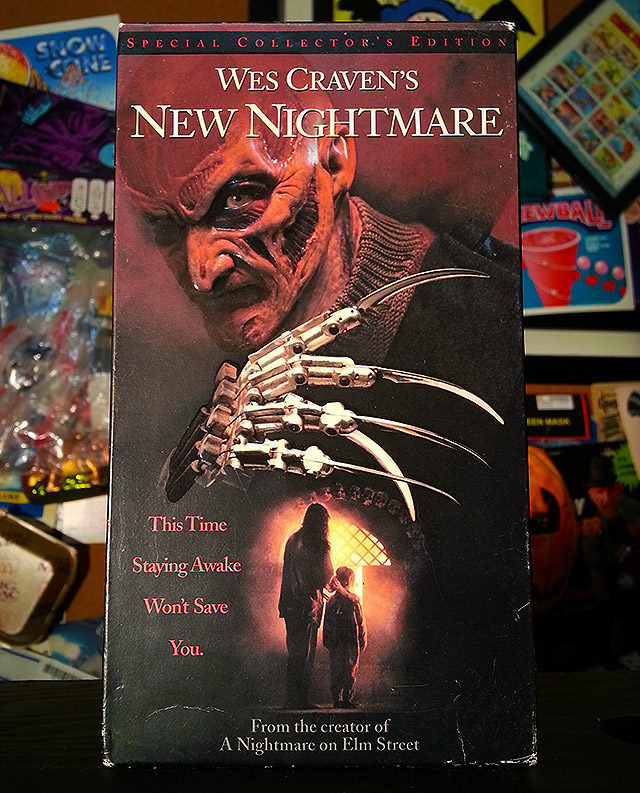
Wes Craven’s New Nightmare
(1994 Theatrical Debut)
The most recent movie on this list comes in dead last. I don’t actively dislike it, but it’s (perhaps fittingly) missing the more “absurd” flavors of the earlier boxes. Truth be told, I love absurd flavors.
The problem is that the art is just too much a product of its time. Many mid ‘90s horror boxes did away with the buffoonery in favor of dark realism and lots of smoke effects. On one front, it’s effective, because if I’m a six-year-old staring at Freddy Krueger video boxes, this is the one I’d be most deathly afraid of. Truly, Freddy had never looked more like Satan. I just miss the fun.
6th Place:
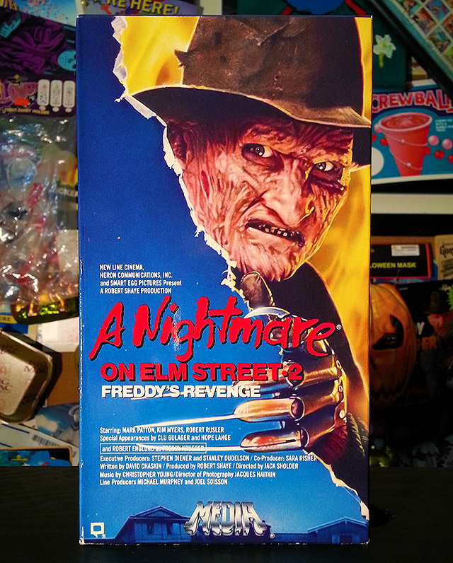
A Nightmare on Elm Street 2: Freddy’s Revenge
(1985 Theatrical Debut)
I like the in-your-face quality of this box, which also highlights the fact that by the time the sequel came around, Freddy wasn’t just a device — he was the star. The first movie’s box only hinted at him, but Part 2’s was literally all about Freddy, with nary a hint of his planned “revenge.”
…but that’s also why it’s ranked so low. The best NOES boxes sent the uninitiated into deep thought, where we tried to envision movies that could possibly match up with such odd and macabre art. “Freddy tearing through paper” is neat, but it doesn’t leave much to the imagination.
5th Place:
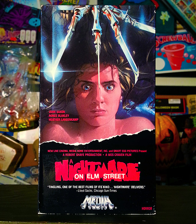
A Nightmare on Elm Street
(1984 Theatrical Debut)
I’m guessing that many of you would place this one higher on the list. Perhaps much higher. Still, separating nostalgia and respect, I’m not so sure that this tops Angry Giant Freddy Heads.
But what it does do is make you wonder. If I’m an Elm Street newbie and I’m browsing the horror aisle, there’s no way I wouldn’t stop at this one. What was the significance of that weird cyborg claw? Was the bad guy a robot? And why is that girl staring at me so hard? She looks kind of demonic. Is she a villain, too?
Similar art was used on the original A Nightmare on Elm Street teaser poster. This truncated version removes all but the slightest hint of Freddy, and all told, I can’t help but miss the monster.
4th Place:
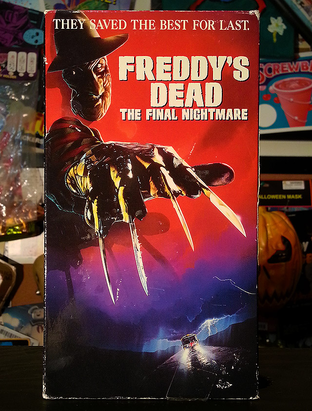
Freddy’s Dead: The Final Nightmare
(1991 Theatrical Debut)
I’m gonna take some heat on this, and I won’t pretend that it’s only because Freddy’s Dead has arguably become the least-loved in the series. I’m sure some of you just think that the box blows.
Sorry, I disagree! I’ve always been a sucker for deep reds and purples in a rough “stack,” and if you focus only on the background, the box looks like the best part of a snow cone.
That’s the nice thing about completely subjective lists. I don’t have to have solid reasons for my choices. “Looks like a snow cone” is good enough.
3rd Place:
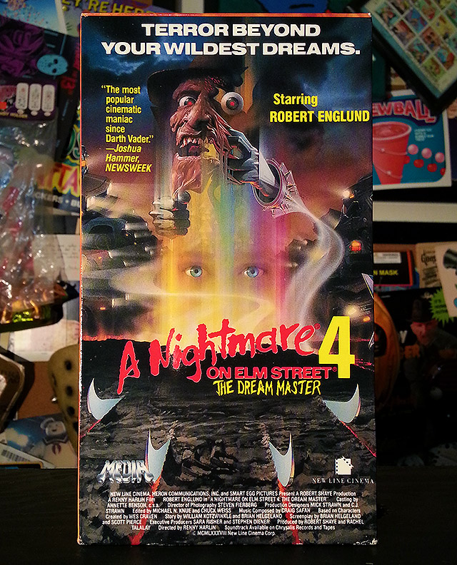
A Nightmare on Elm Street 4: The Dream Master
(1988 Theatrical Debut)
Now we’re in the top three. I absolutely adore every box from here on out, and with almost impossible equivalence. It was very hard to choose between them.
Dream Master’s box does everything right. It’s spooky and scary, but also hella interesting. Only after really studying the box are you able to piece together that this “Dream Master” is using her (?) powers to psychically yank the flesh off of Freddy’s face. I mean, I’ve had this box for years and I’m only now figuring that out.
A critic’s quote on the front compared Freddy to Darth Vader, and it might not be a coincidence that this was by far the most “sci-fi” of all the NOES boxes. Wonder if they were hedging their bets?
2nd Place:
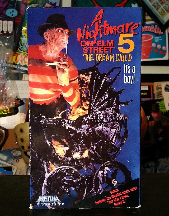
A Nightmare on Elm Street 5: The Dream Child
(1989 Theatrical Debut)
I don’t care what anyone says. I LOVE THIS BOX. The only thing keeping it from the top spot is the fact that they went too jokey. Freddy with a gothic stroller was funny enough on its own. I’m not sure we needed the “shhh” gesture.
On the other hand, the cat was already out of the bag by then. Freddy was a pop icon, and no matter how little you knew about the NOES franchise, you absolutely knew who Freddy Krueger was: A killer as famed for his one-liners as his methods of torment. From a certain perspective, it made sense to be a little more comedic, here.
I didn’t want nostalgia to play a part in my rankings, but I admit that it might be seeping into this one. I wasn’t actively seeking out NOES movies by this point, but I sure remember being mesmerized by Dream Child’s promo materials, which almost universally amounted to “Freddy with a monster stroller.” Oh, how my brain danced at that tantalizing vision.
If you’ve never seen the film, what do you take from this box? You’re probably envisioning a movie wherein Freddy Krueger’s monstrous red baby crawls around with rusty scissors, waiting for its supernatural claws to grow in. That’s much more sellable than the movie’s actual plot, by the way.
PS: Love that Freddy’s wearing his alternative workout shirt. Nice definition on your trapezius there, Krueger.
1st Place:
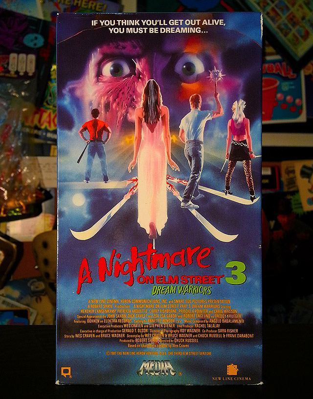
A Nightmare on Elm Street 3: Dream Warriors
(1987 Theatrical Debut)
Okay, let it be known that I desperately didn’t want to make this my #1. Most of you know that Dream Warriors is my favorite film in the series, so I feared that this wouldn’t look completely on the level.
I swear, it is. I tried to convince myself on an alternate order a dozen times, but there was no point in doing this if I wasn’t going to be honest. Even based on VHS box art alone, Dream Warriors really is my favorite.
It’s just a gorgeous box. Like a stormy night, it’s frightening and aggressive, yet weirdly serene. I suppose you could argue that Dream Master had more compelling art, but I think this one gives us so much more to work with.
It was no big leap to suspect that the four teenagers were the Dream Warriors, but what was their story? One looked like Carrie, another was holding a spiked mace, and then there was a girl who looked like Heyday Cyndi Lauper. Horror movie victims didn’t always grab us, especially before we knew much about them. This time, they were probably more interesting than Freddy — even from the onset!
…which isn’t to say that Freddy himself wasn’t impressive. He so was. I’m thinking the artist was a big fan of Krull. Subtly suggesting that Freddy had been reborn as a skyscraper-sized spectral terror dude wasn’t entirely truthful, but it sure did imply that Dream Warriors was going to be more extreme than its predecessors.
But hey, let’s keep it simple. Let’s strip all of the text from every box and imagine them as pure art prints. If we did that, which one would I want framed on my wall?
This one.
Side note: The Dream Warriors team on the box only mildly represented the actual Dream Warriors from the film. None of them are an exact match, and some of them hint at characters that plainly never existed. So now I’m really, really interested in writing Elm Street fanfiction with this team squaring off against Freddy instead.
Your turn! In the comments, tell us how you’d rank the boxes. Remember, the quality of the films should not be factored in. You should judge them based only on much the art appeals to you, and/or how much it intrigues you. I’m ridiculously curious to see the responses!


